(Note from the founder of goodsugar: "I am posting past articles and art work from my time at Juice Press because it was a big part of my life for 10 years. Plus, it’s fun and cool as shit. goodsugar is my second chance in the health food industry and it is a great progression with a better brand and product than my prior projects. I can say objectively goodsugar is better because I do not have creative obstacles, operational nightmares, and corporate pressure to just make money without making something that's good. goodsugar was conceived in my living room on my laptop in exaclty the same manic fashion that juice press was. Thank you." —Marcus.)
Silly Branding

Above graphic: A silly social media post I created for Juice Press parodying "Arm & Hammer Baking Soda's" logo. (Circa 2015).
 Above image for social media: This was a post I made for Instagram. I had a metal JP logo stencil I brought in front of this competitor's retail juice location and posed for a photo with a can of spray paint, I was actually doing nothing. I did not really spray their wall with my logo. I added the white JP logo afterwards in Photoshop. The passerbys were looking at the wall in such a way that in the still image it looks as though they can see the logo on the wall. This made the final image for my social media post realistic. (New York City, Circa 2016).
Above image: Postcard racks displaying the free promotional Juice Press postcards that I created over the years for JP. I made each postcard myself because I thought they made the brand very special. I felt that they were an integral part of building the brand moreso than any other element for JP. The postcards and all of the various writings on labels, signs etc. were the heart and soul of the brand. They were visually impactful, had NY grit, they were informative, some were very humorous, etc. My partner eventually phased them all out as he did not connect with them. After I exited JP in 2019, he later reintroduced several of his own postcards. They were terrific.

Above image left to right: Me with Russell Wilson. Mr. Wilson invested in Juice Press. He is the masterful quaterback of the Seattle Seahawks. He's a great athlete and a great human being. In this photo we were touring Juice Press stores in New York City, Circa 2016. My connection to Mr. Wilson came through my partnership with Kenny Dichter. Long live RW and KD! Long live Juice Press!

Above post card: Front side of one of many JP branding postcards. This one was designed to bring attention to crappy cereals posing as food fed to kids. The summary of the backside read: "If your parents let you eat this crap, you probably should not listen to them about your diet. Listen to me!"

Above image: Social Media influencer Casey Neistat was a frequent guest of Juice Press. Through Karlie Kloss, a mutual friend, I met Casey. He posted JP branded items several times through the years. I appeared in two of his video presentations on Youtube that reached a total of 5 million plus people. Thank you Casey!

Above image: This was a typical day at Juice Press #5 at 122 Greenwich Avenue in New York. (Circa 2015). The Herringbone marble tile was the signature look of the brand. This store had a catherdral-like refrigerator. When we opened in this store in 2013/14 it was the main production facility for our bottled juices. It was only 1500 sq/ft and it was nearly impossible to manage the volume we were doing in those years. We eventually moved production to a 25,000 sq/ft facility in Long Island City, New York.

Above image: Juice Press #16 on 55th street near 6th avenue. The glass of the smoothie station adorned with curiousities hand made by me and then converted into cad-cut decals.

Above image: An interesting creation. I had to conceal electical pipes and refrigeration lines comin from the ceiling down to retail walk-in case. I used these stainless steel custom made cubes and then adorned them cad cut decals of a man's body in an overweight shape and in an ideal weight. The green light reflecting off the boxes is from a really cool green neon sign. This store had a deliberate graphics that were like retail puzzles and things I thought made the store look more interesting. Juice Press #25, 3rd Avenue and 51 street. Circa 2016.

Above image: This was a corny but cutesy and corny social media posting I made to appease the new marketing team at Juice Press.

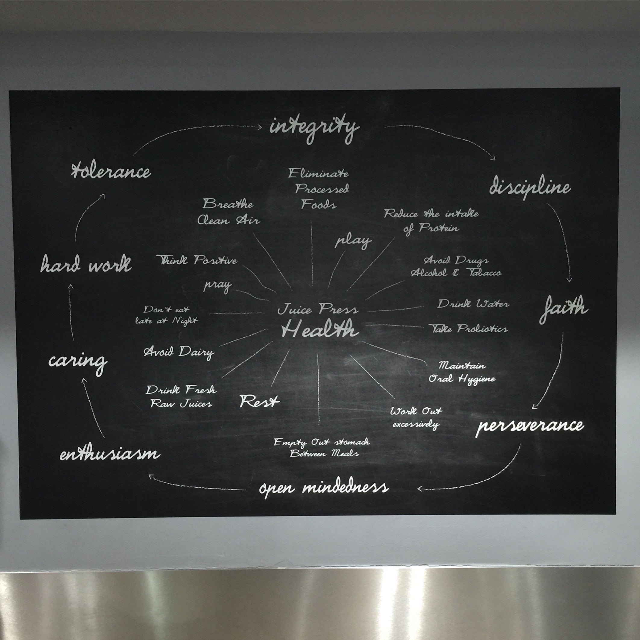
Above graphic: This was a large decal I Posed at JP11, 1 West 22nd Street. Circa 2014. The decal encompassed the life ideals that I adhered to to maintain my sobriety, (sober since 1985).This is one my personal favorites. I made the background look like a chalkboard. This was a square appx. 72" x 72" in size.

Above image: Social media post I created for a product at JP.
